Howdy!
Brand conscious editors may hopefully find this overview useful in further refining any first impressions and/or marketing efforts. Essentially, we’re talking about adding text to a slider, easy right.
Maybe you have used Revolution Slider (the plugin) in the past, or perhaps you are new to this resource. They tout a big game and sometimes including ALL the settings becomes a bit overwhelming to those who choose to not stare at these interfaces all day (*cough). As such we have compiled a short list of concepts and places to click!
Many Brands will want to ensure their colors and typography are consistent, and appear within the existing standards of said Brand. Beyond copywriting, double checking presentations on various screen sizes is highly encouraged in a world where it seems no one has the same screen size anymore.
Revolution Overview:
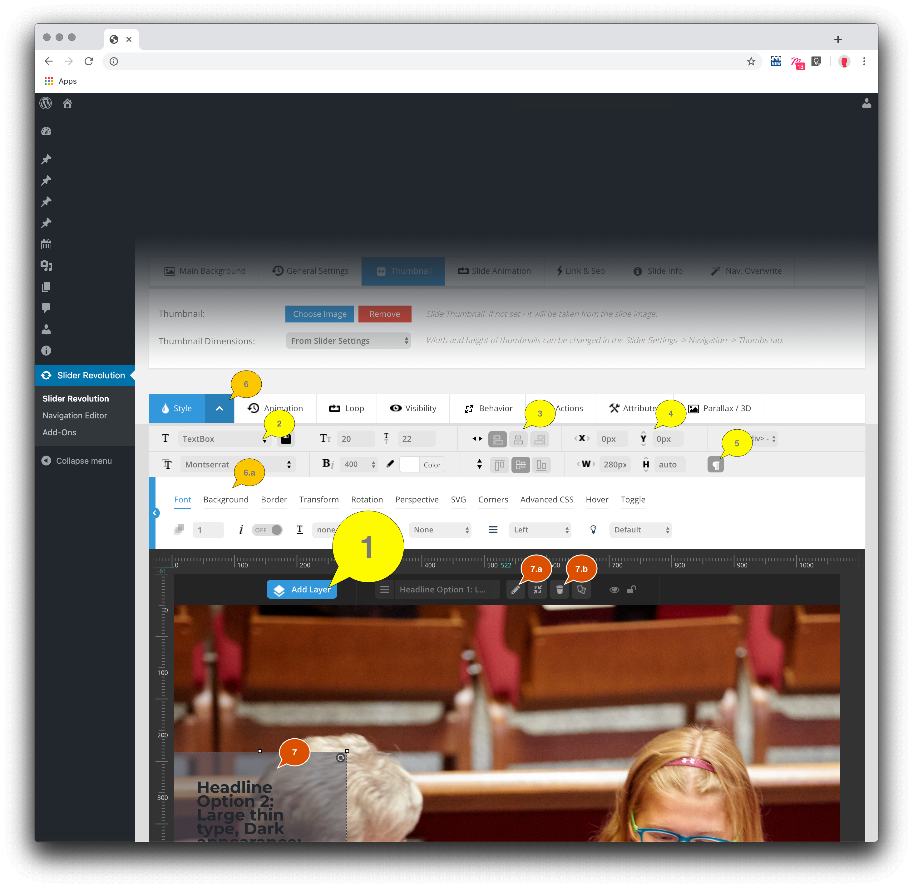 Above is a highlighted screenshot from within Revolution Slider. We can see a few numbered callouts for various editing adjustments like position, font choice, background colors and padding. Below are the corresponding details to the above features:
- ADD LAYER: After our image is chosen, and we want to add a Button or some Text/Html on top of said imagery—we will want to add a new layer.
- Click this blue ‘Add Layer’ button do begin the process, you will be presented with choice of layer.
- SAVED SETTINGS: Customize once, repeat often.
- Once we have set our Brand standards for colors, typography, padding, positioning and spacing—we can save our settings to use with more consistency (and less clicking)!
- POSITIONING: here one can choose to have a button/text align with edges or the center of our slider area.
- Further details on how to customize position outlined below.
- POSITION OFFSET & MAXIMUM WIDTH/HEIGHT: The X and Y cartesian offset settings (for left/right or up/down adjustments) are provided here, additionally width and height settings appear just below.
- Setting a maximum width of 280 pixels ensures content appears consistently on most all screen sizes (even the smallest).
- WORD WRAP: kinda silly this isn’t always on, but if you see your text flowing off the edge of your background, make sure this box/button is clicked.
- Show above in selected state, or rather with this feature turned on.
- DETAILS: Some of these settings get hidden, like #6.a above. If one is looking to update the background color or inside padding (between edge of text and edge of background) make sure the arrow is white and pointing up (as shown above).
- Alternatively the arrow could be black and pointing down— therefore hiding the details in #6.a highlighted section.
- EDIT MODE: To update the words on any button/text layer, first click the element in the slider area (#7) to reveal the options to edit, update or delete the item.
- #7.a — edit
- #7.b — delete
Here’s the skinny: a layout designed to work on all screens requires less maintenance. As such, the smallest screens are about 320 pixels wide, and therefore when adding overlay elements (such as text or buttons) to the slider area—that one checks the presentation against all screen sizes—even the smallest. The Revolution solution offers many settings and if perhaps a small workshop with those empowered may be most beneficial, to become familiar with more granular details, please reach out to [email protected] for times and availabilities. Below are some of the more salient points:
- We Can Add Text; Positioning consistently in a flexible layout gets tricky…
- To make this a bit easier we can pin our text to any side of the screen: the top, top-right, right, right-center, right-bottom, bottom-center, centered completely, left-bottom, left-center or left-top edge/corners are possible initial options.
- Offset, one can offset this position by a certain amount. An example of this may be the desire to add a call to action button to the bottom center of the slider area … just the not exact-flush bottom. Thinking in a cartesian grid, where X values move left/right and Y values move up/down, we can simply add some Y pixels that push our example button UP from the bottom (#4 in the screenshot above).
- Headlines, Paragraphs and Anchor Tags. Oh My! To customize how text is displayed, websites have certain tags* used to style different text, which include but are not limited to: “<h1></h1>” “<h2></h2>” “<h3></h3>” “<h4></h4>” “<h5></h5>” “<h6></h6>” “<p></p>” and “<hr>” …
- Headline tags* are the largest and we have six available options to customize for Brand consistency:
- h1 / h2 — (in HTML code they look like this: <h1>Light Title</h1> or <h2>Dark Title</h2>)
these can be the largest headlines in light and dark brand colors - h3 / h4 — (in HTML code they look like this: <h3>Medium Title</h3> or <h4>Medium Dark Title</h2>)
these can be medium headlines in light and dark brand colors - h5 / h6 — (in HTML code they look like this: <h5>Small Title</h5> or <h6>Small Dark Title</h6>)
these can be the smallest headlines in light and dark brand colors
- h1 / h2 — (in HTML code they look like this: <h1>Light Title</h1> or <h2>Dark Title</h2>)
- Mainly folks use Paragraphs to add content, paragraphs CAN have links or anchor tags* styled for Brand consistency as well.
- p — (in HTML code they look like this: <p>Exciting Announcement! Click below for more info…</p>)
these are blocks of copy at or about the readability size of the smallest headline - p a — (in HTML code they look like this: <p>Click <a href=”#”>HERE</a> to register today!</p>)
these are blocks of copy that contain a link/anchor tag
- p — (in HTML code they look like this: <p>Exciting Announcement! Click below for more info…</p>)
- Lastly, we have rules, specifically horizontal rules that can help create a line between a headline and/or paragraph.
- hr — (in HTML code they look like this: <hr> )
these are unique tags* that are self-closing
- hr — (in HTML code they look like this: <hr> )
- Headline tags* are the largest and we have six available options to customize for Brand consistency:
- Background Color. One of the best Branding bits to mention would be the use of color, here we can set a background color for our layer.
- #6.a in the above screenshot shows where these setting can be adjusted.
- Adding a background color will help to make our text more clear and readable against vibrant dynamic background images.
- Here we have options to set the color, opacity as well as padding.
- Padding refers to the amount of space INSIDE our layer’s edges.
- #6.a in the above screenshot shows where these settings can be adjusted.
- For example, having a text box “positioned” flush-right may require a bit more “padding” along the right edge, to prevent words from appearing too-close to this edge. Adding something between 20 and 40 pixels of padding may give our information just enough breathing room.
- While active, this is really only visibly when a layer (such as Button or Text/Html) uses a Background Color.
*TAGS are a term used for the funky looking code web pages use to display pretty much anything. Most TAGS require both opening and closing TAGS
[tags bolded here for clarity] for example, in HTML code a Paragraph may look like this: <p>We are excited to announce our yearly retreat, click below for more info</p> where the last bit [the “</p>” part] is the ‘closing’ TAG for a paragraph that uses that extra ‘/’ … ).
What is unique about the HORIZONTAL RULE is they do not require a closing tag, or rather they are self closing and therefore do not need the extra slash. “<hr>” is rare in this regard and thus this extra bit of explanation for edification.


